Interaction Design
Interaction Design
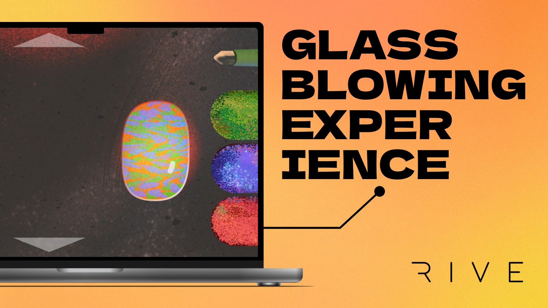

Our glassblowing experience allows players to morph, color, heat, and display an amorphous blob of hot glass. With a wide variety of tools at their disposal, they can create dozens of unique glass sculptures. There is no right or wrong way to create.
This was a partner project with fellow designer Jennifer Saloutenko.
About the project
Role + Responsibilites
Rive production, illustration in 2-person team
Timeline
6 weeks
Tools Used
Rive, Procreate
Specs
Used Rive (free plan), desktop only, minimal text
Teammates
Jennifer Saloutenko
About the project
Role + Responsibilites
Rive production, illustration in 2-person team
Timeline
6 weeks
Tools Used
Rive, Procreate
Specs
Used Rive (free plan), desktop only, minimal text
Teammates
Jennifer Saloutenko
Prompt
How can we boil down a complex subject into simple, fun interactions?
Solution
We allowed players to access glass in a way that you can’t in real life, making the digital experience even more special.
Prompt
How can we boil down a complex subject into simple, fun interactions?
Solution
We allowed players to access glass in a way that you can’t in real life, making the digital experience even more special.
Wait, what's Rive?
Rive is a beta (as of the time of creation) collaborative design software that can create interactive elements. You can keyframe animations along a timeline, but also set up state machines to create a variety of outcomes based on user input. This was a new program for me.
Wait, what's Rive?
Rive is a beta (as of the time of creation) collaborative design software that can create interactive elements. You can keyframe animations along a timeline, but also set up state machines to create a variety of outcomes based on user input. This was a new program for me.
Initial planning went quickly and smoothly…
We wanted the player to experience something that they usually couldn’t, so we went through ideas such as bird flight, planetary orbits, and metalsmithing. We arrived at glassblowing for these reasons:
Initial planning went quickly and smoothly…
We wanted the player to experience something that they usually couldn’t, so we went through ideas such as bird flight, planetary orbits, and metalsmithing. We arrived at glassblowing for these reasons:
Ooh, pretty!
Aesthetically, both the process and final project are mesmerizing.
Ooh, pretty!
Aesthetically, both the process and final project are mesmerizing.
No wrong answer
As this artform is subjective and diverse, we could empower the user by allowing them some freedom.
No wrong answer
As this artform is subjective and diverse, we could empower the user by allowing them some freedom.
It’s tactile
Who wouldn’t want to interact with an organic blob of molten glass? There was much opportunity to make responsive interactions that bring the user super close to the process.
It’s tactile
Who wouldn’t want to interact with an organic blob of molten glass? There was much opportunity to make responsive interactions that bring the user super close to the process.
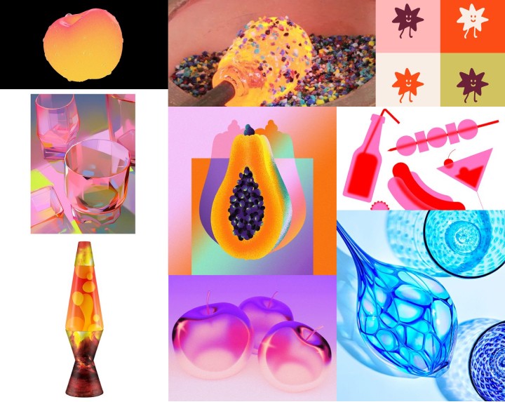
We decided to use a simple, grain-heavy style, paying attention to the glass and its dynamic properties. With a focus on color and form rather than detail, we could properly convey the vibrant, glowing effect of the glass. Here’s our Pinterest moodboard.
We decided to use a simple, grain-heavy style, paying attention to the glass and its dynamic properties. With a focus on color and form rather than detail, we could properly convey the vibrant, glowing effect of the glass. Here’s our Pinterest moodboard.

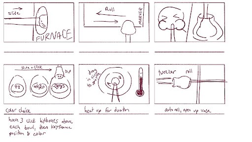
At first, we planned on having the process be extremely linear with only one or two choices that affect the finished product. We even had a player character and tools that interface with the glass for you (as you’ll discover later, this was where we faltered a bit).
At first, we planned on having the process be extremely linear with only one or two choices that affect the finished product. We even had a player character and tools that interface with the glass for you (as you’ll discover later, this was where we faltered a bit).
Then, the “Uh-oh” moment strikes.
Up until about half way through the project, we had created a very straightforward idea of glassblowing, with the specific tools used to create it. But our professor clarified with us his true intentions for our project: to think in a more abstract, nonlinear way that allows the player to come closer to the essence of our subject.
I had misinterpreted this “think abstractly” rhetoric as visually abstract. Our forms were already so simple, there was no way to go further! However, I didn’t think in a conceptually abstract way. Things didn’t have to be accomplished as they do in real life. We even removed the blowpipe—instead, the user’s cursor shapes the glass like dough. We pivoted towards a more sandbox-style interaction.
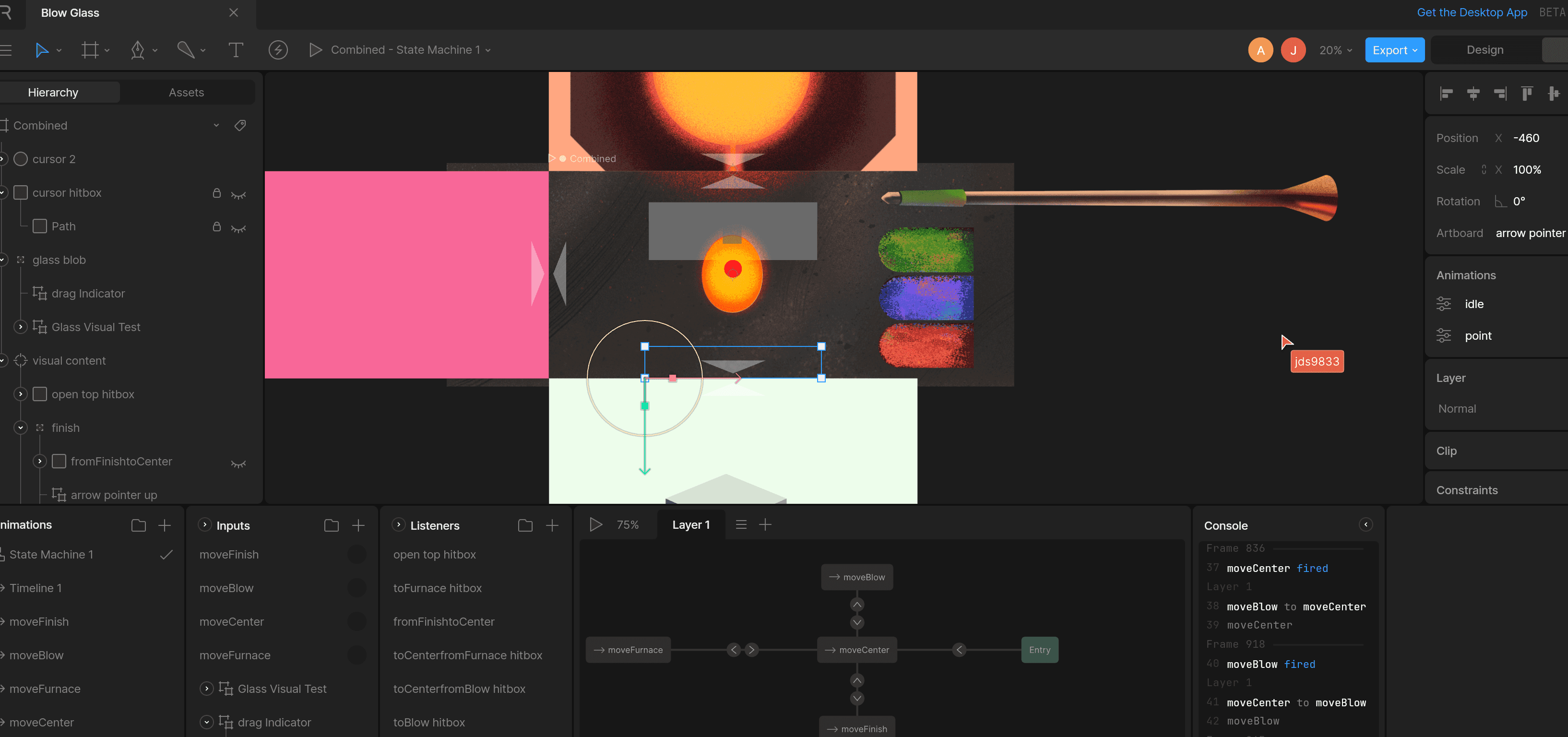

Rive: a (state) machine of chaos
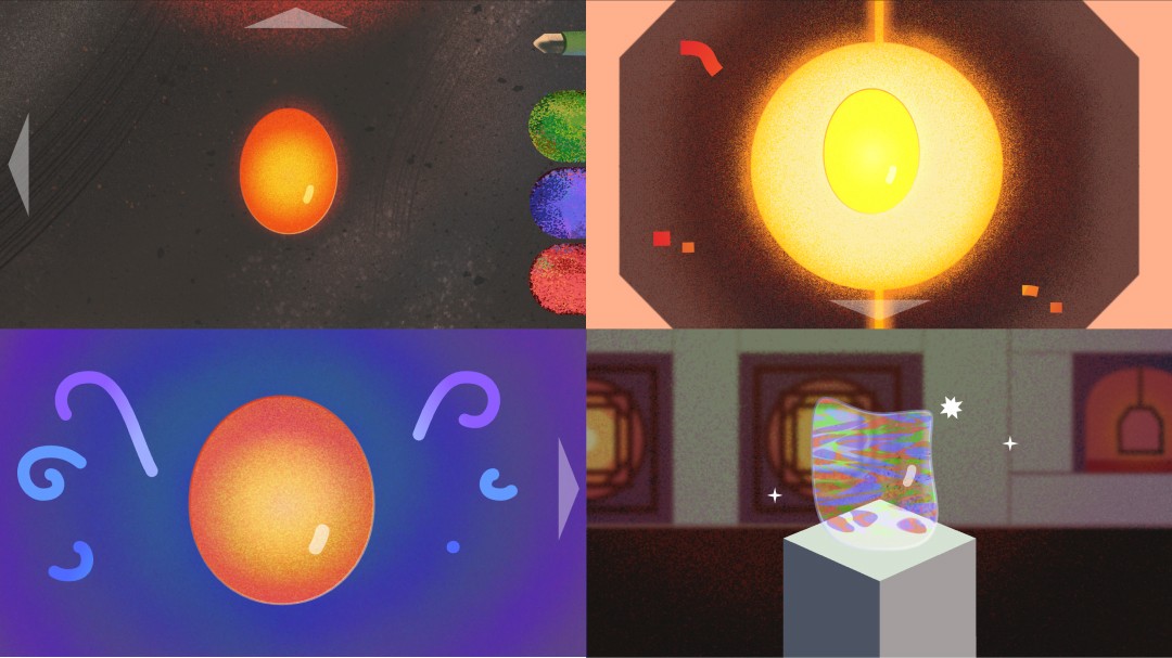
After "faking" interactions in Figma or After Effects, it’s refreshing to make something real. We had two main components: the workspace environment and the glass blob. I developed the four-panel idea where bringing the mouse close will bring you to distinct areas, each with core interactions. There was a lot of debugging to do, especially given the nonlinear nature of things.
Our end result feels like playing pretend—when you’re a kid, you can do fun versions of usually laborious and complex tasks like cooking or building. I think we brought some childlike joy and whimsy with our glassblowing experience.

Project Reflections
Great!
We worked together well and I really enjoyed working with Rive, bugs and all. I also enjoyed our aesthetic direction.
Meh…
I managed my time poorly during the middle of the project, taking away time to polish our idea. It also took us halfway through the project to truly understand the project prompt.
How can I improve?
I want to add more things for the user to do, especially when it comes to creativity. There were a decent amount of options but there's room for much more.
In all...
Despite the struggles, i think we were successful in our final product due to the hard work we put in. I'm glad that we can bring such an amazing artform to users in a fun, approachable way.

